
- Authors

From Zero to One — Building a Visual Language
The Other Side of Cool
Every product wants to look impressive. In Web3, that impulse ran especially deep. Bold colors, intricate realistic graphics, overwhelming visual production — all of it designed to signal that something serious was happening here. And the more that aesthetic compounded, the more intimidating the space became for anyone trying to walk in for the first time.
We were looking for the opposite. Something that might seem understated at first glance, but grows on you the longer you look at it. Something honest rather than flashy. Warm rather than technical. Finding that direction took longer than expected.
"We already knew Web3 was hard. So the least we could do was make sure it didn't look hard too."
The Choices We Made
Defining a direction is really a series of decisions — not just about what to do, but about what not to do. We looked at where the market was heading, and made deliberate choices to go somewhere else.
| Other | Spacebar | |
|---|---|---|
| → | Web Browser | |
| → | 2.5D | |
| → | Minimalism | |
| → | Organic & Approachable | |
| → | Casual |
As those choices stacked up, a style emerged that felt distinctly ours. It comes down to three words.
Organic + Minimal + Casual = Style
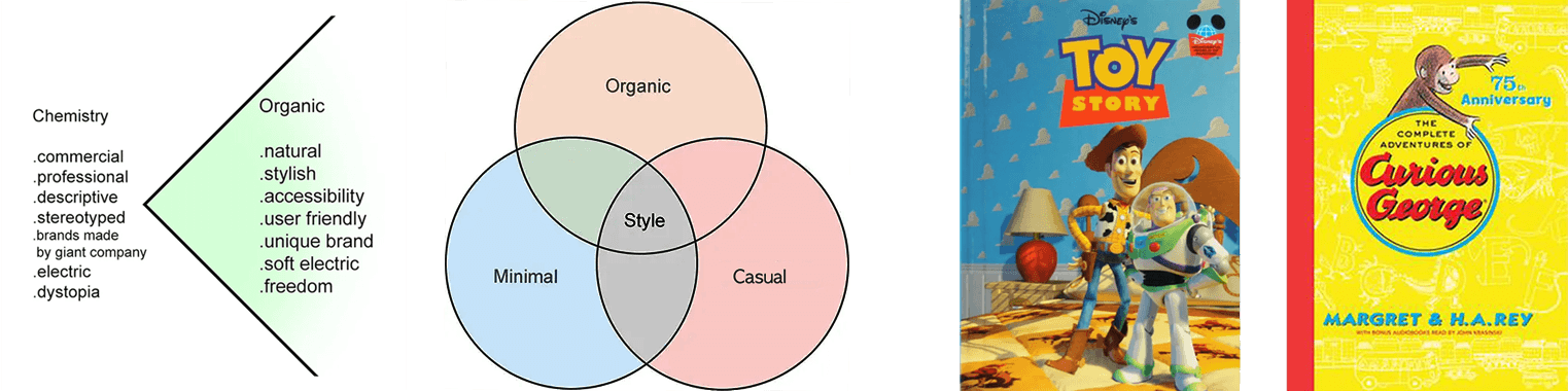
Here, "organic" means something that doesn't feel overly commercial or artificially polished. Think of it this way — if Toy Story represents the commercial end, Curious George sits on the organic side.
Imagine a beautifully produced Toy Story hardcover next to a Curious George paperback. Toy Story is technically impressive — detailed illustrations, high production value, everything finished to perfection. And yet Curious George has always been a bestseller, while Toy Story books often end up in the bargain bin. The irony is that the more "complete" something looks, the less room it leaves for the person holding it.
"An overly finished product leaves no space for the user."
Products work the same way, especially new ones. When a design feels too finished — every detail decided, every corner polished — users don't just lose room to suggest improvements. They lose the feeling that there's any space for them at all. But when a product has that raw, organic quality, users naturally start filling in the gaps with their own imagination. They sense there's room for them, and that pulls them in. In Web3, where community is everything, this balance is genuinely difficult to get right — but we believed it was one of the most important things to get right.
A White Universe — Flipping the Script
Space is dark. Everyone knows that. Black backgrounds, glowing stars, a heavy and mysterious atmosphere — that's the default image. And Web3 ran with it. Dark interfaces, glowing elements, the whole aesthetic of something cosmic and impenetrable.
We flipped it. In Universe ETH and Universe Blast, the universe is white. Every main screen is built on a white background. The dark, familiar version of space only appears inside game mode. The everyday space is open and bright — the game space is deep and dark. That contrast itself created the experience of moving between two worlds.
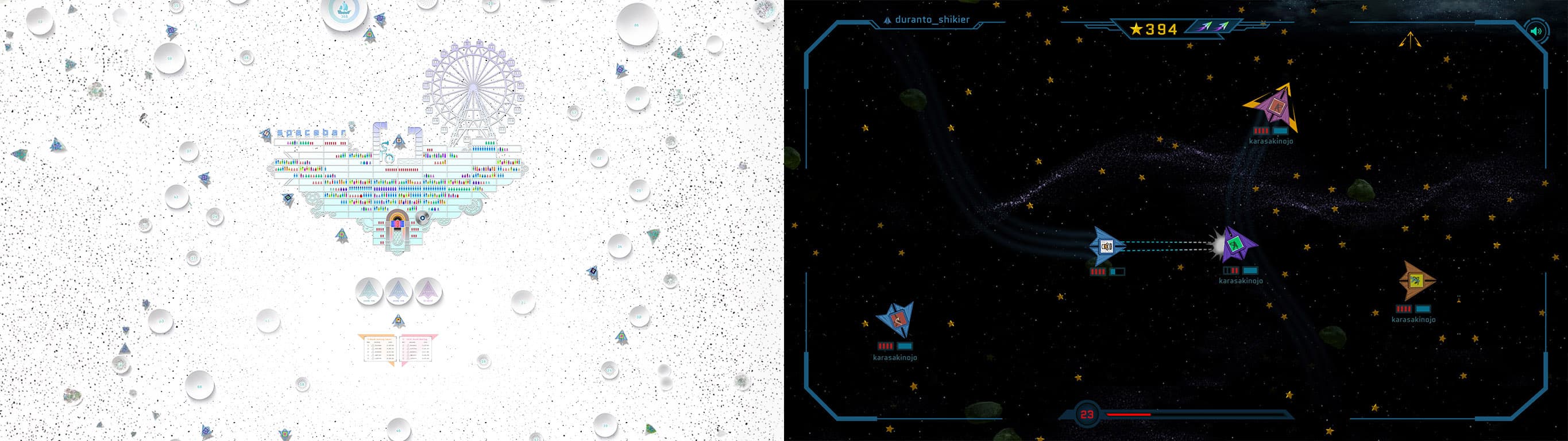
| NORMAL SCREEN MODE | GAME MODE |
|---|---|
| The White Universe | The Dark Universe |
| All everyday space. Bright and open. Spacebar's default environment — a deliberate inversion of expectation. | Only accessible inside the game. Deep, immersive, the space we recognize from the cosmos. |
This wasn't just a color choice. It was a statement about minimalism — and a conscious move away from the heavy visual identity Web3 had built up. A white, open space holds more possibility precisely because it isn't already filled. Empty enough to become anything.
One Spacebar Key to the Universe
What we were really trying to build wasn't just a game or a platform. It was an experience — one that starts as naturally as pressing the spacebar on an ordinary keyboard, and opens into an entirely new Web3 world.
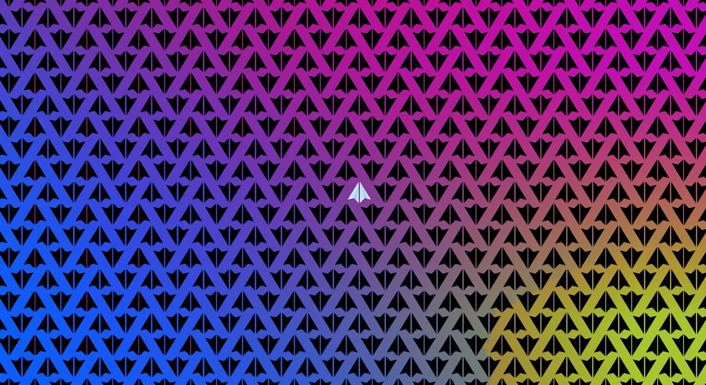
We imagined the journey like this: one paper airplane, chosen from among countless others, takes flight. It guides you through connecting your wallet, leads you inside, links to your NFT, and carries you out into the universe. Not an onboarding flow — a journey. One where you're the protagonist from the very first moment.
Three Core Principles
01 Emotional Pull — The Power of First Impression
People respond to feeling before logic. The moment someone walks in, something needs to pull them in.
02 Accessibility — Simple UX, Intuitive UI
Most users decide how they feel about a product in the first few minutes. If it doesn't spark curiosity, if it feels too hard, if there's no early excitement — people leave.
03 Minimalism and Streaming — Light Tech, No Downloads
Heavy installs, long loading screens, complex setup — these exhaust people before they even arrive.
The Unboxing Feeling
There's a particular kind of excitement that comes with a new laptop, a new phone, a well-made product encountered for the first time. The moment you open the box. Nothing has happened yet, but something already feels like it's begun. That quiet thrill of a first meeting.
Users make up their minds early. If the first few minutes don't spark something — curiosity, excitement, ease — a lot of people won't stay long enough to find out what's deeper inside. We wanted the first encounter with Spacebar to feel like that unboxing moment. No manual needed. Open it, and you're already there.
So we stripped the UX back as far as it could go. Minimal UI. One step at a time. Nothing that would make someone stop and think "wait, what am I supposed to do here?" And at the peak of that emotional arc — the first screen after connecting your wallet, a white canvas — just one word.
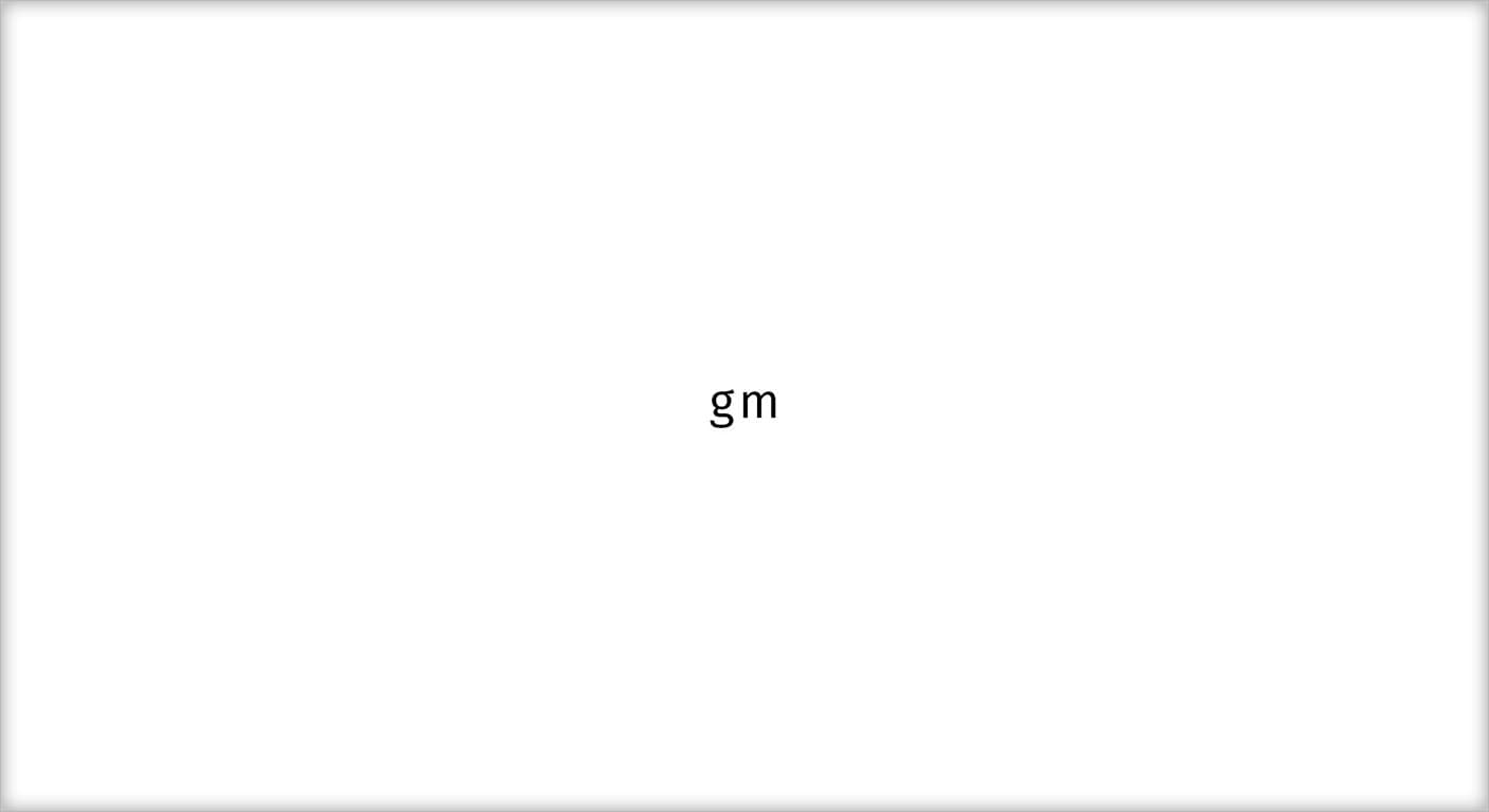
In Web3, "gm" isn't just a greeting. It's a signal — a way people in this space say good morning to each other, a quiet acknowledgment that they're here, again, today. After everything it takes to get through onboarding, the first thing you see is that word on a white screen. That simplicity was the feeling we were after. You worked to get here. But where you've arrived is warm, familiar, and quiet.